
28 Feb
2013
28 Feb
'13
2:26 p.m.
Hello all,
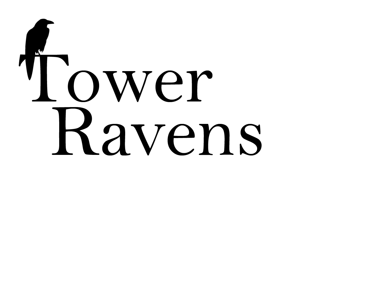
Following a discussion with Sue, there is a proposal for a Theme 1b option.
The advantage of this over theme 1, is that it is a more standard font,
thus meaning we would be able to use the font on the website, rather than
just on images.
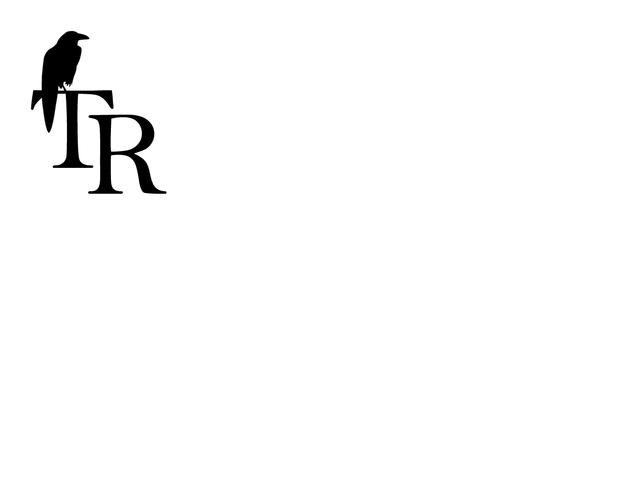
With regards to crispness, theme 1b, like theme 2, hasn't been made into
a final (vector) image yet, so please don't judge them on the
crispness/smoothness of the image. This is very apparent on the 'R' of
theme 2, and will be smoothed out to look like the 'final hopping bird' all
over.
Happy voting!
Lindsey
---------- Forwarded message ----------
From: Lindsey Kennedy <kennedy.linds(a)gmail.com>
Date: Thu, Feb 28, 2013 at 12:14 AM
Subject: Logo voting. Ends Sunday.
To: team(a)towerravens.org.uk
Ok - sorry it's a little later than planned.
Voting finishes midday on Sunday - so I can finalise designs for the
business cards, to be voted in Monday, so you guys can take them to DERT!
There are two themes.
Theme 1 - Raven sat on top.
Theme 2 - Raven 'R'.
Both Themes include a banner, logo and possible business card layout. The
business card's aren't final and are there as an illustration.
The last page of the document is a very quick idea of what a little bit of
colour might do. If anyone has any idea's for how to add colour into the
mix, that would be brilliant, please email me! I've done a few ideas with
highlighting the raven feathers on both designs, but it's taking alot of
time, so though I would only develop that on the final design.
Vote here: http://www.doodle.com/thfneevax6npp8ry
Lindsey
P.s. I did mock up the design for theme 2 with the gothic font, but it
looked really bad, so I've ditched it. It's attached for those who would
like to wince.
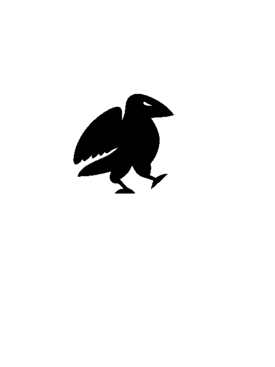
P.p.s. I've also attached the little hopping bird, cos he's cute, and took
ages to draw! I thought whatever we chose we could probably fit him on the
website somewhere.